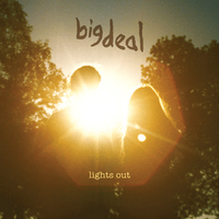
What we did was look at different websites which had a vaerity of different album artwork, fashion photography that we could use and photographs from magazines. One of the websites that I went on which had inspired me was booooooom.com. What inspired me in this website was the use of different colours and patterns and objects. I thought that using different objects such as broken glass or a rotten flower could symbolise the protagonists feelings; how she has been hurt and heart broken.
Looking at Sarah Blasko's albums, I came across one which had also inspired me. In this image she is lying down not looking at the audience which is powerful and links to the song we have selected. What I thought of is that we could have Kim in the same position and instead of the blue hair, we could have different patterns in black and white. The reason why I thought of black and white is because it reflects her mood and feelings and also because it would look strange if we had used colour. Not only is it inspiring, it also refers to intertextuality:


No comments:
Post a Comment